Redesign Grocery Shopping Experience

Background

It was mid June 2020. Canada was in it’s third month of lockdown due to the Covid-19 pandemic. Then, I was a student of Juno College of Technology, Toronto. As a part of my class project, I redesigned the grocery shopping experience of Metro which is the third largest grocer in Canada. I was particularly interested for the topic, as during the lockdown, I noticed a significant change in the grocery shopping behaviour among my friends, family and specifically in myself. I shifted to eating at home, limited the frequency of store visits, became more dependent on online purchase. So I was curious to know the newly evolved grocery shopping experience.

Role

User Research, Synthesis, Ideation, Testing, Interactive Prototype

Timeline

June 3- June 17, 2020

Project Type

Individual

Tools

Sketch, Invision, Miro, Zoom

Design Process

I followed design thinking process by first conducting user research. After synthesizing inspiring insights from the research, we defined the problem and jumped right into the ideation phase. After creating the wireframe, we tested it with users and came up with Hi-fidelity prototype.

design process of metro

Research Goals

The goal of my research is to evaluate the user experience of Metro Grocery by assessing user behaviors and needs during covid-19 pandemic. Key questions and areas of the research were:

Methodologies

For conducting the research, I reached out to my family and friends living in Canada who had recent experience with buying groceries both online and in-store during pandemic.

design methodologies of metro

From Research to Insights

Due to the lockdown restrictions in Canada , I took the interview via Zoom, monitored user activity via it's screen share facility and recorded each session. From the interview recording, I made a interview transcript for each participants. Also, during usability test, I took notes about participant's response which I later summarized in a spreadsheet. Then I gathered all my observation from user interviews and usability test into a affinity map to identify common pattern. Besides, I also took help from the obeserations from my heuristics analysis to transform the observations into insights.

affinity mapping of metro

The Affinity Map to identify common patterns

from observation to insights

Research insights derived from the observation of affinity mapping.

Problem Definition

From the research insights, I decided to tacle two major problems.

Problem One

  • What is the nature of the problem?

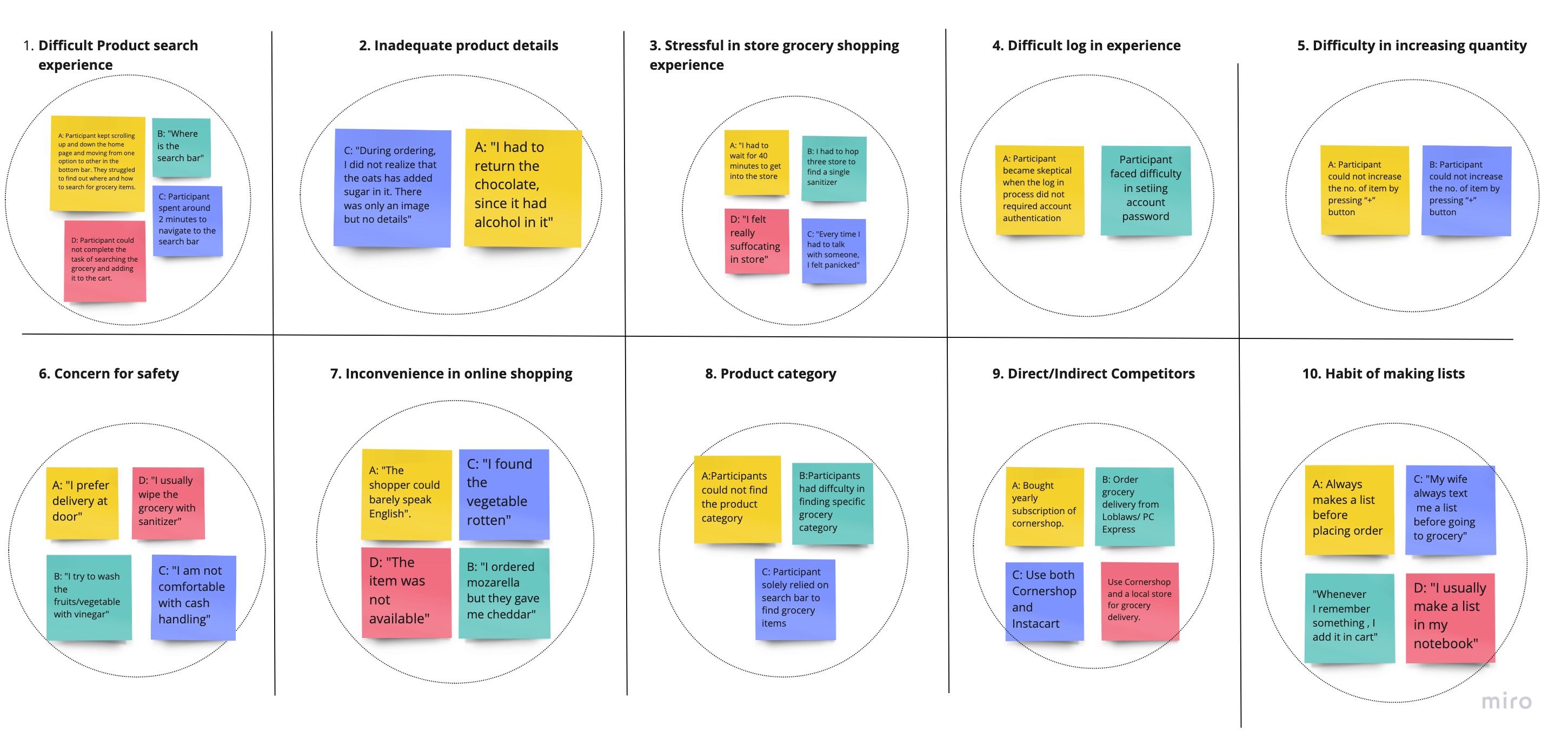
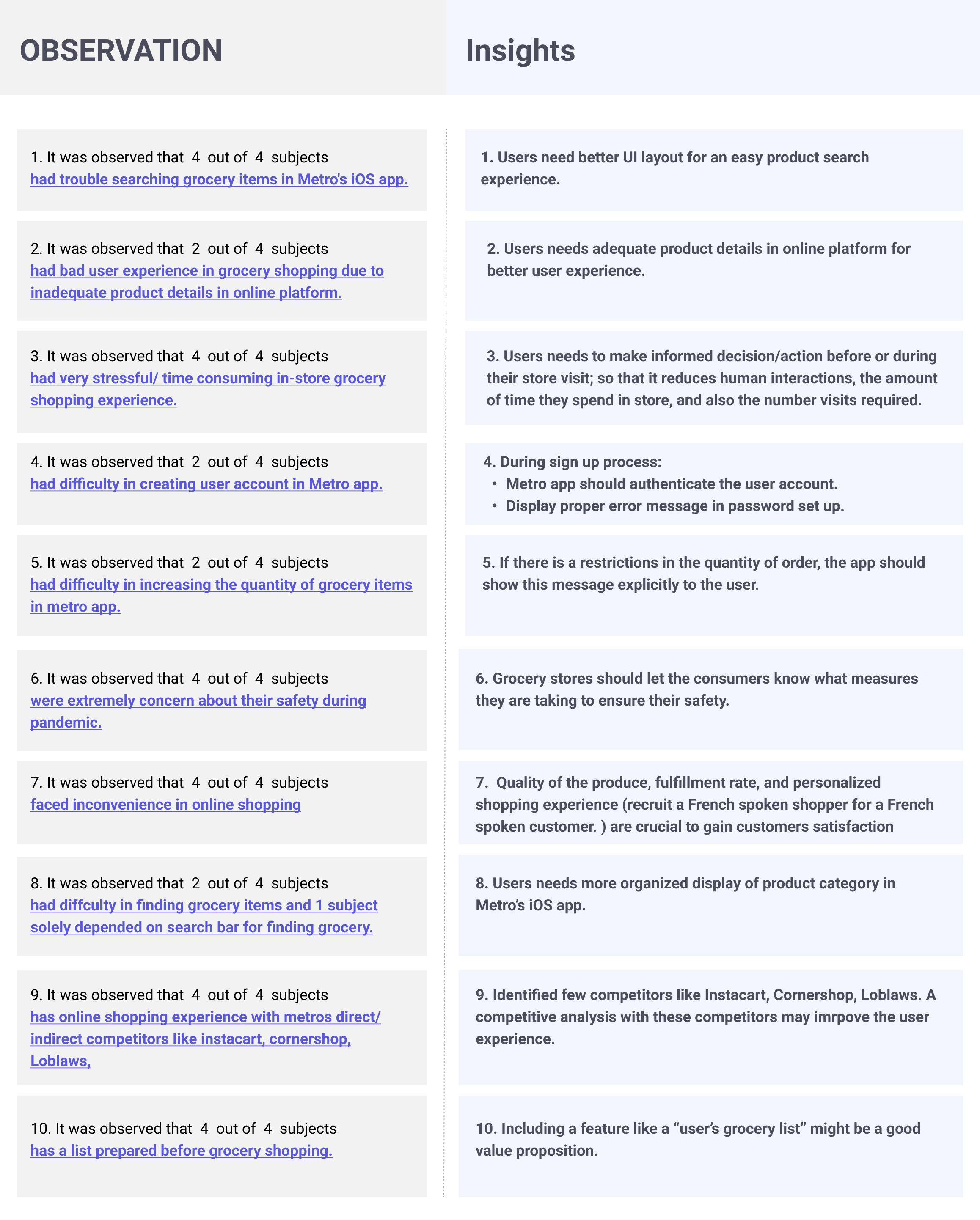
    During Coronavirus pandemic, users feel extremely stressed and panicked while visiting the grocery store in-person

  • Who is facing of the problem?

    Users who shops grocery in-store

  • When/where does the problem arise?

    When there is human interactions, long waiting times to get in the store, increased number of store visits due to stock unavailability

  • Why is the problem worth solving?

    To ensure better store-visit experience during pandemic.When there is little difference between the products and price between stores, a better store visit experience will yield more business.

Problem Two

  • What is the nature of the problem?

    The user interface of Metro Mobile App is extremely difficult and time consuming to use

  • Who is facing of the problem?

    Customers who wants to order grocery online

  • When/where does the problem arise?

    When customers wants to search grocery in Metro Mobile App

  • Why is the problem worth solving?

    Due to the recent scenario emerged from covid-19, people are getting used to and relying more on ordering grocery online; and customers expect the process to be easier and less time consuming. Due to the difficulty of using the user interface of the mobile app, customer might switch to other grocery delivery option and the business will lose its customers.

Design Goals

During the ideation phase, I had following design goals in mind:

Design Decisions

Comprehensive Product Details

Research indicated that inadequate product information cause poor user experience. I noticed, metro mobile app currently does not contain necessary product details. So, I decided to include a comprehensive "Nutrition Facts" in the product details section. This will decrease the volume of returned products in the store which will be beneficial for business. Also, customers will be less required to visit the store for returning unwanted products.

comprehensive product details

Inventory Information

I introduced information on products' availability and exact location (Aisle no) in users nearest store.

The information about the Aisle no. will allow the users avoid unnessary roaming in the store and significantly reduce the shopping time. It will help users with mobilty issue as well.

Also, the users can make informed decision about which store to visit if they know beforehand the information on stock availability in a particular store. It will reduce the number of unnecessary visits to the stores where the products are not available.

inventory information

Introducing "Scan" Feature

I introduced a "Scan" feature in the app. So that, when users need any information (i.e. sale price) about any product in the store, instead of asking help from the store representative, they can simply scan the barcode of the product and access the information through the mobile app. The feature will reduce human interactions and save the shopping time.

scan feature

Redesign "Product Search" Experience

Research indicated that, as per the existing mental model, users expect a search bar when they land in the home page of an app. During the usability test, it seemed a long-winded task for users just to find out that there is a “Shop online on metro.ca” link which they needs to click to get access to the search bar

search problem

Also, the content of the app seemed scattered enough that users had difficulty in some basic product search related use cases such as product search by category/ sale.

To make the product browse experience more seemless, I decided to make following changes:

home redesign

The Usability Test

As a part of User Expereince Design Course, Juno College of Technology arranged a usability testing sessions for their cohort where they invited their alumni to test their student's prototype. In this session, my prototype got tested by 2 participants which gave me insights that there still room for improvement. What about those users who wants to check the aisle no. of a long list of grocery items during their grocery visit? Let's say for 20 items, he has to search 20 times.Why not showing the information in one place?

The Improvements

Research indicated that users usually have a list before their grocery visits; either in text, paper or on mobile. In my design, I included a feature where users can make a list of grocery, and view the stock availability in one place.

home redesign

The Final Version

home redesign

Reflection on my work

It was the very first time for me working as a designer in a UX case study. I spent quite amount of time discussing and reviewing my research and design decisions with the amazing mentors of Juno College of technology who is working as UX industry experts. I learnt how to effectively convey my rationale and justify the design during the discussions back-and-forth, and it drove the entire project towards a better direction.